Rolling Stone’s Magazine Makeover: Bigger and Bolder Than Ever
What are we trying to do here? It seems ridiculous to even talk about a print magazine redesign in 2024. What kind of half-mad maniacs would embark on such a strange and labor-intensive endeavor? What would be the point with tens of millions of stories, videos, songs, and various other distractions competing for your attention each day? But that’s precisely why we think it’s so vital to deliver our award-winning journalism, photography, and design not just online, but in a form that encourages everyone to slow down a little, turn some beautifully crafted pages, and just take everything in at your own pace.
The magazine got its name from the Muddy Waters song “Rollin’ Stone,” itself inspired by the saying “A rolling stone gathers no moss.” This is as true now as it was in 1967, when Rolling Stone was founded on the idea that the Beatles should be covered by the press as seriously as Richard Nixon. Both were important forces in the world, with one important distinction — a love of music can set you free. Ever since, music and politics have been intertwined in Rolling Stone’s’ DNA.
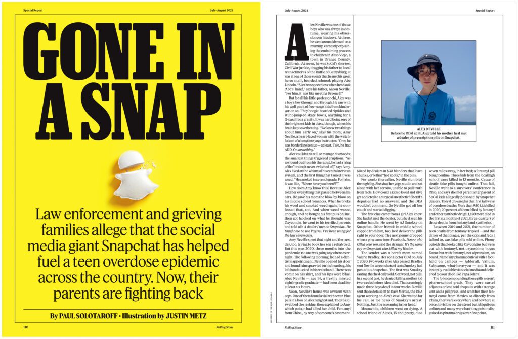
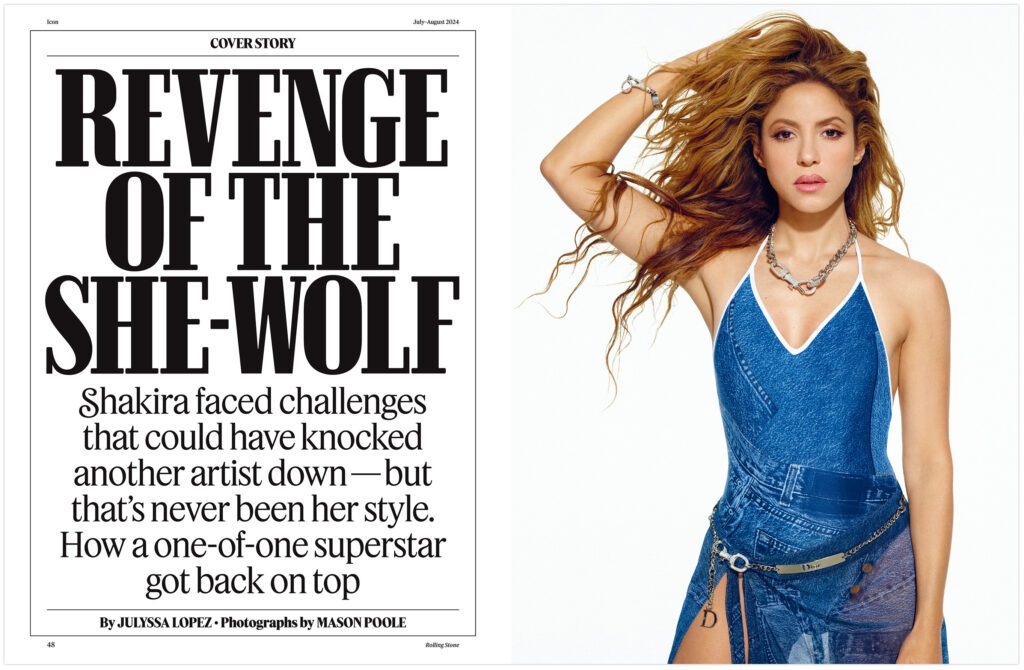
Rolling Stone has always embraced change. To open up the redesign process, Creative Director Joe Hutchinson worked with the design studio Food to reimagine what a print magazine can be each month. With the help of C-LL-CT-V-LY designer Mark Leeds and type designer Christian Schwartz, they crafted exclusive fonts for Rolling Stone and helped the design team reshape everything inside our book. As you flip through its pages, you’ll see we’re packing in more stories, adding more franchises (and bringing back some classics), emphasizing our criticism, expanding long-form features, and going deeper on just about everything. We’ve also changed our paper stock, giving a grittier feel to a magazine that has always told stories from the edge.
The goal was “to capture that enthusiasm, exuberance, and the depth of knowledge that exists in Rolling Stone,” Leeds says. “Everything’s a bit larger, a little bit louder, a bit more energetic.”
You’ll soon see the new design reflected on our website, social channels, video, and all other Rolling Stone platforms. “I have redesigned Rolling Stone at least four times now and this is my absolute favorite,” Hutchinson, who has worked at Rolling Stone for nearly two decades, says. “Collaborating with Food and C-LL-CT-V-LY on this redesign was amazing. We took inspiration from past eras of the magazine and yet the design feels totally fresh and modern. It reminds us of why we love Rolling Stone, showcasing fantastic writing with photography that delights, illustrations that entice, and packaged in a bold presentation that entertains.”

This double issue is proof that the original mission remains crucial as ever: A profile of Shakira moves into the Rolling Stone Interview with Vice President Kamala Harris, which is followed by a six-month investigation into Diddy’s history of violence and more than nine months of reporting on the teen opioid crisis on Snapchat. Spend some time with the stars of the WNBA, hang with the cast and creators of The Boys or take a dive into the crazy world of rock memorabilia. There’s so much deep reporting, exceptional writing, and stunning photography, as well as a brand-new look from our design team. Go find a copy, give it a read, sit with it or pass it around, and enjoy.


